Tabla de contenido
[zoomsounds id=”3-design-tweaks-to-help-your-online-store-gain-a-competitive-edge”]
Building an eCommerce store that stands out from the competition is not a task to be taken lightly. For example, WooCommerce, the eCommerce platform we specialize in building and optimizing at Mode Effect, now works with over 60% of online stores and has over 11 million downloads. That represents a host of stores competing for consumer dollars with new online stores joining the Internet’s ranks on a daily basis.
In previous years, it was enough to be online; all that was required to generate sales was a presence. Unfortunately, the e-commerce environment is no longer that easy. Managing an online store has become a business in which you must seek all possible advantages, regardless of size, if you want to stand out and generate sales.
The good news is that even with all the competition, there are some common mistakes and oversights that many WooCommerce retailers continue to make. Most of the time, it’s the little details that can make the difference between a sale or not. In a business where low single digit conversions are the norm, every little advantage makes a big difference.
We’ve rounded up three easy design tweaks that could help your WooCommerce store gain a competitive edge. But first, let’s discuss why these settings are really important.
WooCommerce Design Tweaks: The Big Picture and Continuous Improvement
Before moving on to some specific ideas, it’s important to explain where design tweaks fit into the bigger picture. There are many WooCommerce store owners who are under the impression that there is a simple set of rules that apply to all WooCommerce stores. By simply following a set of predefined rules, you will be able to maximize your chances of success.
While this theory may be true in the most basic sense (everyone knows that responsive design is key, right?), it’s not necessarily the best approach to take. This is the problem:
Every store, every customer, and every interaction is different . There is no quick and hard way to do things that is guaranteed to work for all stores. In fact, as soon as you adopt the attitude that “this is the right way to go”, your progress can stop.
A much better approach is one where you realize that your WooCommerce store is unique. What works well for a competitor might not benefit you at all. The only way to find out what really works is through experimentation and testing.
With this general concept in general, let’s discuss three design tweaks that can provide a starting point for your WooCommerce store that you can tailor to your unique product offering and shopping environment.

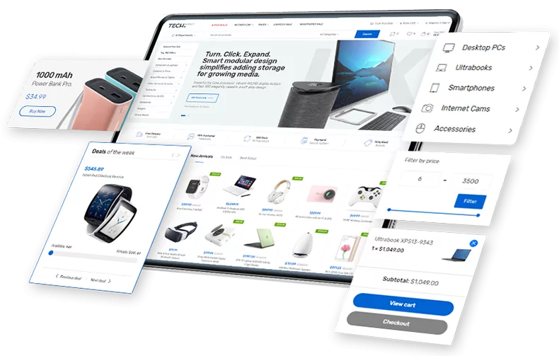
1. Create a subscription to get visitors’ contact information early in the process
At the time this article was written, Listrak was showing that the average shopping cart abandonment rate could be as high as 79%. That figure is consistently between 65% and 90%, depending on the season. Cart abandonment is a real problem that demands your attention. But how can you tweak your site’s design to help offset this puzzling statistic?
It’s more important than ever to create some sort of bond with your prospects, even if they’re in research mode. Create an offer in exchange for an email to encourage a potential customer to buy using a discount code.
One thing you can do is examine your payment process. The method in which you order your payment and how quickly you get a visitor’s contact information can have a dramatic effect on your long-term marketing efforts.
When a visitor comes to your site and fills their shopping cart, more often than not, they’re just window shopping, checking prices, and comparing shipping costs. If they abandon their cart early in the process and leave your website, there’s a good chance they’ll never come back, unless you’ve managed to capture their contact information.
There are a few ways to achieve this goal. One idea worth considering is capturing some of your visitors’ information at the beginning of the checkout process. Even if you start with just a name and email address, you’ll have opened the door to more communication (like sending recovery emails after quitting).
You can also take a Blueberry -like shopper club approach: have your visitors sign up to receive access to your store and special offers. Or perhaps it would be more appropriate to present a special offer or coupon in exchange for an email address (using a welcome email from email marketing software is a useful tool for this).
Whichever method works best for you, the goal remains the same: find a way to open a communication channel between you and your prospects as quickly as possible.
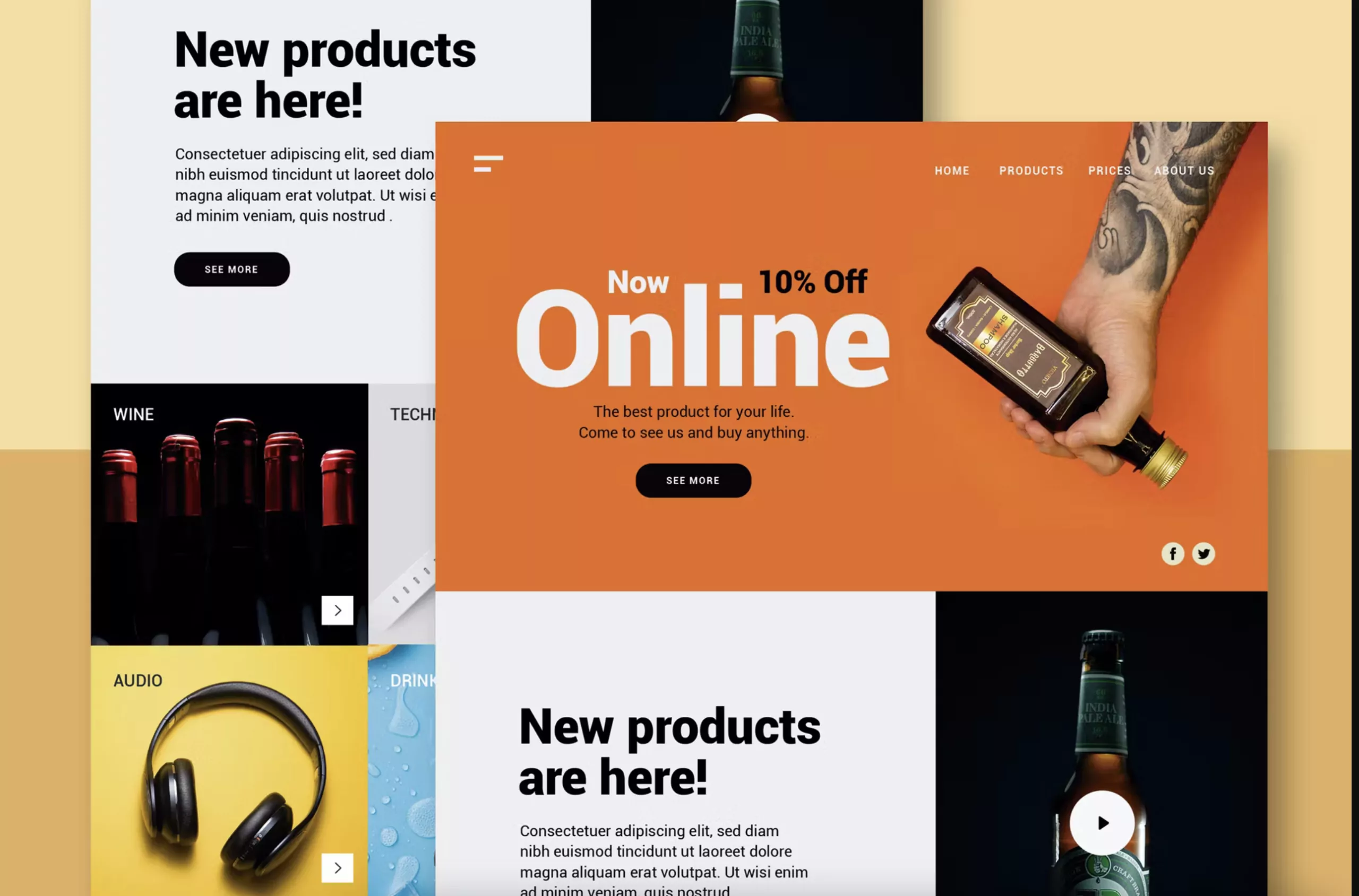
2. Use beautiful and relevant images

While WeLoveWeb is not an image-intensive site, one important thing you will notice is that the images are highly relevant. If you’ll excuse the pun, they reek of nostalgia. For a record store that is 27 years old and places a heavy emphasis on the local music scene, it was essential to bring as much of the store’s atmosphere and experience as possible onto the website.
It goes without saying that images are not an optional component of your WooCommerce store. ConversionXL put together a great post that talks about how you can use images to increase your conversion rate.
Sites like Made.com , Bestmadeco.com , and even one of our own clients, yurbuds.com , do an exemplary job selling products with great images. Seriously, I dare you to visit those sites without filling your shopping cart.
If you spend any time looking at sites that use images to sell, there are a few commonalities worth noting:
- Professional images are a must . Good quality photos cost more, but quickly separate the amateurs from the professionals.
- The environment and the environment are important . Are your products displayed in a context that makes sense to the end user?
- Do your images provide an adequate amount of detail? When shopping online, you need to compensate for the fact that your customers rely on only one sense (sight) to make a decision.
- Use real life scenarios . By showing the use of your products in a real life scenario, your visitors will be able to imagine themselves using them.
Images on your WooCommerce site deserve as much attention as any other element. People buy with their senses – the more you can use that to your advantage, the further ahead you are from your competition.
Online Store that sells!
Do you need a redesign or a new website for selling online?
Complete solution for retail and wholesale. Great UX/UI designers, experienced programmers and high emphasis on testing. If you are looking for a professional partner for your business in the online world, contact us!
3. Communicate your value proposition quickly and clearly
The final design change we will propose is to make sure you communicate your value proposition as quickly and clearly as possible. Too many WooCommerce stores take a “me too” approach, leaving visitors feeling uninspired and unmotivated.
When a visitor comes to your site, you want them to know what makes your store and brand different from your competitors. It could be the quality of your products or a statement about your customer service.
For example, Bose frequently uses ” Better Sound Through Research ” to convey high-quality speaker sound and picture. Zappos uses ” Powered by Service ” to put their amazing customer service at the forefront.
Conveying your value proposition is one of the easiest design tweaks you can implement on your WooCommerce site. It’s also something you can easily experiment with to find out what resonates best with your visitors. Just remember, your value proposition cannot live in a bubble. It has to be supported and reinforced by the other elements of your website.
Endless ecommerce design tweaks
We’ve covered three very specific layout tweaks in this post. Hopefully these ideas will get you thinking about some potential changes or improvements you could consider implementing on your own WooCommerce site. The possibilities are literally endless.
Just remember that any changes or adjustments you make have the potential to give you a competitive advantage. However, the only way to be sure is to measure and track your results. Never assume that there is only one “right” way to do things. Different images, different value propositions, and different checkout sequences can give you an edge over your competition.
Scroll down the page, open the Add to Cart button menu , and select the button and checkbox :