[zoomsounds id=”tips-on-how-to-create-a-good-successful-logo”]
Modern businesses rely heavily on effective communication with potential customers. Marketers strategize to ensure that people can participate in a business in a variety of ways. Therefore, business owners spend a lot of money creating visual tools to engage and interact with people. Nowadays, the logo is not only a commercial symbol to identify a company and its products or services, but it helps to create a strong brand identity. Even logos designed with an online logo maker have the same essence as a logo designed by professional designers.
A logo serves many purposes in the modern business world. You can send the right business message to your target audience. A professionally designed logo has the power to turn people into loyal customers. There are many ways a well-designed logo can serve your company and business.
Here are some tips for an effective logo design
know the brand
Before you start designing your logo, make sure you have an idea of the brand. Keep this in mind that the logo must reach a particular group of people, which is the target market and customers. So write down what your business, brand, and market are all about. Find out what the brand’s ideology is and what inspirations it has for the future.

Also know the personality of the brand. Is it a softer brand or a harsher brand in terms of its tone? How do you want to project yourself among your market and your customers? All these details must be ready in advance. This information will guide you in creating your logo design. You will choose the elements of your logo taking into account the information about your brand.
Reflects the nature of your business
Make sure your logo is fully capable of representing your business. The colors and images used in your logo should align with the business you run and the products or services you offer. It is when a logo aligns with your business that it will create a brand identity for your company in the competitive marketplace.

Target customers will also get your message when the design reflects your business and its values or attributes. So, whether you’re recently designing or redesigning your business logo, keep these three important tips in mind to establish your business in a competitive market.
Printing is crucial
Your logo design should leave a lasting impression on the market and customers. Just one look at their logo is enough to mesmerize people. The logo works for a business by attracting customers again and again once they have a good impression of the design.

To create an impression, make sure that your company logo is unique, which means that your design should be based on a new concept so that it stands out from the crowd of logos in the market. The logo must also be better in design than its competitors.
Use colors in a planned way
Colors play a crucial role in determining a brand’s message. For example, using red as the main color in your logo will send the message that the brand is aggressive, passionate, and energetic. This means that your brand intends to target young customers. If blue is the main color, it will evoke feelings of intelligence and togetherness. This is the reason why most social channels like Facebook have blue logos. If you want to create a social media page, consider having blue as the main color in your design.

Use bright, bold colors to grab people’s attention. But these colors should also speak to your brand personality. Remember that each color evokes an emotion, which becomes your message to viewers or customers. There is a science behind colors, which modern graphic designers use effectively.
Choose fonts carefully
Many designers simply do not pay attention to the selection of typefaces and choose them at random. Typefaces speak of a brand’s personality. Most likely, a typeface used for a toy company logo is a script typeface. This is because children are the target customers and you want to project your brand as a child-friendly business.

Likewise, if you’re creating a logo for a rock music band, choose bold fonts that create a strong personality for your band. So, make sure there is not a mismatch between the typeface you chose and your brand personality. If your choice of typeface doesn’t speak for your brand, your logo will send the wrong signals to your potential customers.
Also, avoid using gimmicky fonts. If possible, use your own unique fonts that you have to create especially for your logo. You can also think about using very high quality fonts that are now available for free on the web. Logos like Coca-Cola’s are recognized for their custom fonts. By using the right colors, you will create a logo and brand identity.
Choose the type of logo
Do you want a logo that has the name of your company as its main feature? That could be the best logo idea. Such a logo is known as a logotype. Famous examples of logos include the Ray-Ban, IBM, and Coca-Cola logos.
If you choose to have a logo, customers will be able to see your company name right away. This means that your logo will also become your brand advertisement. You will not spend much to generate publicity about your brand. The logo will tell people your company name. Small businesses with a small marketing budget benefit from logos.

But if you choose to have a symbol as your logo, you will need to spend a lot of funds on building awareness about your brand. Famous companies that use symbols as logos include the Apple logo that has a half-byte apple as its business symbol.
You can also think of a combined logo that has both the symbol and the company name. Said logo will indicate the name of your company together with a commercial message of the symbol.

Professional Business Presentation
Do you need a redesign or a new website for your business?
Complete solution for small, medium or corporate business presentation. Great UX/UI designers, experienced programmers and high emphasis on testing. If you are looking for a professional partner for your business in the online world, contact us!
keep it simple
Every expert logo designer and any graphic designer will lend you this advice. They all put extra emphasis on creating a simple logo design by graphic design services. When we talk about a simple logo, it implies that one or two colors, fonts and other elements should be used. Viewers should get the message at first sight of the logo. But if there are too many confusing colors and fonts or a complex logo shape, it will send a mixed signal to viewers.
A simple logo is also a memorable design. Most of the global business is represented by their simple logos. Take, for example, the Nike logo. It’s a simple swoosh logo. The Pepsi logo is made of only two colors. The Samsung logo has a color. The Apple logo has an application as a symbol of its business. Design simplicity is not just limited to logos. All of your graphic design products like brochure design etc should also be simple, neat and clean.

Many companies have their name in the logo, while others only have some illustration. Both types of simple logos are capable of fully capturing the attention of the customers. Your logo can have colors and images, but the target audience must be able to understand the design. Avoid creating a complex logo that has a large number of colors or fonts or a network of lines, as such a design will be too ambiguous. You can see the Google logo. The Google logo is the simplest logo in the world.
Remember that a simple design easily becomes part of the memory and the audience does not have to make efforts to understand again the company and the business behind the logo. Therefore, the simplicity of a logo goes a long way in creating a brand identity, as customers can easily remember the company and its business. That is why most of the companies around the world use logo design contest sites to get simple and minimal logos for their brand.
Make it scalable
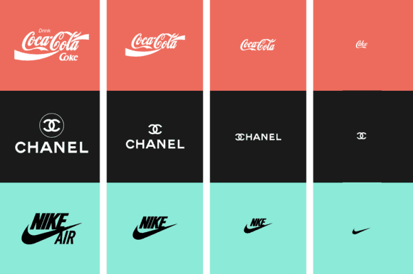
Another quality of a great logo design is that it is easily scalable. Remember that your logo will feature a variety of advertisements. It should appear as an impressive logo in all media. This means that when blown up to larger proportions on a billboard, the logo should look stunning. It should be part of the billboard design.

But if the logo loses its sense of proportion and some of its design elements look awkward on a billboard, the logo is a failed design. Similarly, if a logo needs to be printed on a smaller surface, such as on a promotional product like a pen, the logo details must be visible.
It should be awesome in colorless version
Another effective tip for creating a powerful logo design is to make sure it’s equally impressive in black and white. There are many cases where a logo appears without colors. It can be in documents, faxed documents, newspaper ads, office supplies, and many other items. For example, a newspaper advertisement is usually in black and white. This means that your logo must make a lasting impression on viewers of your ad.


One of the tricks to creating awesome black and white logo designs is to make sure they look great at the sketch stage. When drawing a pencil sketch, don’t rely on colors. Many designers think that the logo will become impressive after filling in the colors. A better way is to fill in colors only when the logo is a memorable design without colors as well.
So, these are our powerful tips to consider when designing your logo. However, you can leave it all to a professional graphic designer.


